

Creating a successful website is akin to constructing a landmark building – the foundations are hidden, but their strength and integrity are visible in the finished product that stands the test of time. For the architects of the digital world – web designers – understanding these foundational principles is not just important; it is the singular distinction between a website that thrives and one that merely survives.
Here, we distill the 15 fundamental principles that guarantee a website not only navigates the complexities of digital interaction but excels in them, ensuring that every click, tap, and scroll is a step towards a deepened relationship with your audience.
Understanding How Users Think
Cognitive psychology teaches us that human behavior on the web is not fundamentally different from customers in a store. Visitors glance at each new page, scan some of the text, and click on the first link that catches their interest or vaguely resembles the thing they’re looking for. Your design must facilitate that experience rather than work against it.
How users can a website (https://www.nngroup.com/articles/f-shaped-pattern-reading-web-content/)
Remember, content is king. Mediocre won’t cut it. Users are savvy – they prioritize quality, and they can smell credibility from a click away. They’ll opt for high-quality content over flashy design and intrusive ads every single time.
Patience on the web is as thin as your smartphone screen. Websites need to deliver and do it now, or your audience will vanish like a Snapchat message. Users don’t read, they scan, and they don’t pick the best choice; they settle for the first good enough option. Forget the sequential flow; brick-and-mortar rules don’t apply here.
Control is not just for the remote – your users demand it from their browser experience, too. They want familiarity, and they want it consistent.
Usability
You’re here to create a website that not only looks good but works like a charm. Remember, it’s usability and utility that herald the triumph of a website, not just its visual aesthetics. Sure, a gorgeous design can draw people in, but it’s the user-centric approach that converts visitors into loyal customers. Your site needs to cater to their actions, anticipate their needs, and provide a seamless journey. If a user stumbles upon a feature that’s as confusing as a Rubik’s Cube, guess what? They won’t use it, rendering it about as useful as a chocolate teapot.

You don’t need instructions plastered everywhere like a how-to manual, but clarity is key. If a user can’t immediately spot your search box, they might as well be wading through quicksand. We’re not going to regurgitate the placement play-by-play—that’s covered ad nauseam elsewhere. What’s pivotal is grasping the main principles, heuristics, and approaches that pave the way toward your enviable web design. It’s about distilling complex information into digestible bites and leading your audience with sophistication. Make each decision count, and watch as your web design matures from a jumble of ideas into a beacon of user satisfaction. Remember, the power of a well-designed website lies in its subtlety and its strength in functionality.
Simplicity
Simplicity is the soul of efficiency and it reigns supreme in web design. Remember, in your palette, less is more. You assert dominance in the digital space not by cluttering, but by streamlining. Let me lay it out for you:
– Colour:
Choose a limited colour palette – think five colours or fewer. Complementary colours aren’t just easy on the eyes; they’re a secret handshake that tells your audience you know what you’re doing. The right colours evoke the right emotions, pulling your users in and keeping them engaged. This isn’t a kid’s finger-painting session; choose with purpose.


– Typography:
Typography isn’t just letters on a page; it’s the voice of your brand. Want to be heard? Keep your font entourage tight – three max. Clarity is your wingman here, ensuring your message isn’t just seen, but felt. Fonts speak volumes before a single word is read; make sure yours is telling the right story.


Imagery
This is showtime. Expressive imagery, whether photography, illustration, or video, is your brand flexing its muscles. High-quality images tell your audience you mean business – you’re professional, credible, and you’ve got the chops. But it’s not just about quality; your visuals must drip with personality, the essence of your brand. Images aren’t window dressing; they’re the windows to your business soul. I recommend making use of high-quality royalty-free images such as unsplash.com, or pexels.com.
Purpose Sets the Foundation
Your mission statement isn’t just corporate fluff; it’s the compass that steers every pixel and placeholder on your site. Your website has to embody your mission with the precision of a laser-guided system. Whether you’re in the business of e-commerce or educational content, each aspect of your site should align like stars in constellations – flawlessly pursuing your ultimate goal.
Understanding your audience is akin to holding a map of treasures. Know their preferences, their hang-ups, and what keeps them awake at 3 A.M. Then, and only then, can you craft a message so compelling, it feels like you’re answering their midnight thoughts.

Let’s talk about visuals – your brand’s handshake in the digital world. It needs to be firm, confident, and memorable. Visuals and content are not arbitrary choices; they reinforce your brand’s uniqueness. Dare to be different, offer value that towers over your competitors, and your brand fingerprint will remain with those you seek to serve, long after they’ve left your page.
And when it comes to CTAs (Call to Actions), I don’t mean those lackluster “Click Here” buttons. No, I’m talking about CTAs that are as irresistible as the “skip intro” button on your favorite show. They should encapsulate your brand’s vibrancy and convince your users that clicking through is the best decision they’ll make all day.
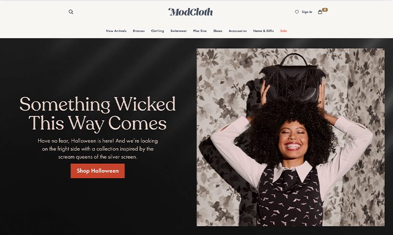
Here’s a great example of an effective and eye-catching call to action: https://modcloth.com/
Remember, in this theater of the web, your website is your stage, and every element, from messaging to media, plays a pivotal role. Only then will your audience truly resonate with the purpose at the core of your exquisite digital experience.
Visuals keep people engaged
Visuals are the vanguard of your brand identity; they echo your voice before a single word is uttered. You don’t just slap on a hero image for kicks—it’s your brand’s firm handshake to the world. Make that first impression with an image that’s got enough punch to draw a gasp. It’s not just eye candy; it’s the electric charge that propels your visitors to stick around and dive deeper.
Let’s lay down the law about balance: your text is the king, but visuals serve as the ace in your sleeve. A crafty blend of photos, illustrations, and graphics punctuates your words, adding rhythm and cadence to your brand story. Think of animated transitions and scroll-triggered effects as the encore that keeps your audience wanting more—immersed, engaged, and enthralled.
High-quality, crystal-clear, and color-balanced imagery isn’t up for negotiation. And remember: size and resolution are your loyal subjects; command them wisely to fortify your visual fortress. Stay true to your brand’s style; consistency here breeds familiarity, and familiarity breeds trust. Unleash your visuals with deliberation, and watch your brand’s energy radiate from the screen.
Make Use of Effective Writing
Effective writing isn’t about fancy words or convoluted sentences—it’s about communication that slices through the noise like a hot knife through butter. Research shows that clear, concise, and jargon-free content wins the day. According to the Nielsen Norman Group, web users tend to scan new pages they come across and, on average, have time to read at most 28% of the words during an average visit; 20% is more likely.
You’ve got to hook them fast, keep it simple, and deliver value, and you’ve got to do it all within the span of a blink. Use active voice to add zest and directness to your prose.
Grammar and spelling are your bedrock. Google’s algorithm favors quality content; misspellings and poor grammar can harm your search engine rankings. According to a Global Lingo study, 59% of consumers would not use a company that had obvious grammatical or spelling mistakes on its website or marketing material because they wouldn’t consider them sufficiently professional.
Website Loading Time
You’ve got a razor-thin window to captivate your audience, and studies are clear: nearly 50% of users expect websites to load in 2 seconds or less, and a delay beyond 3 seconds? That’s audience adios. It’s a digital dash where every millisecond counts.
Time to ditch the ballast that’s dragging your user experience down to the depths of the search rankings. Want to crack the code on speed? Visit 10 ways to improve page loading speed.
White Space: The Eloquent Silence
Some may call it “empty” space, but let’s set the record straight: it’s anything but. This is your secret weapon to creating a user experience that’s as smooth as silk and as intuitive as your natural instincts.
White space isn’t just about aesthetics, it’s about breathing room; for your content, for your visuals, and most importantly, for your users’ eyes. It’s the pause between the notes that makes the music.
It divides your content into digestible, bite-sized chunks, which is crucial because, remember, your audience is scanning—not reading—each page. And when your users scan, they’re on the lookout for signals of hierarchy, a visual pecking order that tells them what’s important, what’s secondary, and what’s a footnote.
Use white space to create that hierarchy. Emphasize your most important content.
Typography:
Your typography is the voice of your design. It can whisper, shout, or sing your content’s importance to your audience.
Simplicity in your body text is not just a preference; it’s proven doctrine. Traditional sans-serif typefaces, like Arial or Helvetica, ensure swift legibility while providing that professional sheen you’re striving for.
You might recall the furor when Comic Sans made an unwelcome appearance at the Higgs boson announcement—a font faux pas that nearly eclipsed a monumental discovery. Lesson learned: Typography affects the integrity of your message. So, wield your fonts with precision, balance your design elements, and let your typographical choices resonate with purpose. Your brand’s character depends on it.
Conventions are Critical
Make sure that when users land on your pages, they find comfort in the familiar. Conventions in web design, such as consistent navigation and text structure, instill users with confidence, trust, and reliability. Sure, creativity is your ally, but clarity is your champion.
Usability testing can confirm the effectiveness of conventions; for example, users should be able to navigate a website in a different language even if they can’t understand it.
Utilize the ‘F’ Pattern
Human behavior tends to follow patterns, including how we consume content on websites, often in an F-shaped pattern according to Nielsen Norman Group’s eye-tracking studies.
The F-shaped pattern involves reading headlines at the top, scanning down the left side for numerals, bullet points, or sidebars, and then across again for bolded text or sub-headings.
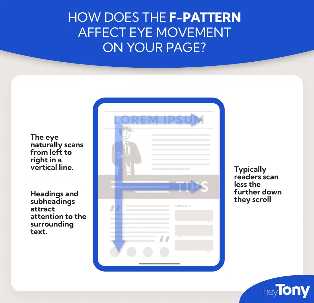
Illustration by HeyTony.ca
Consider Using Grid Systems
Grid-based layouts organize content into sections, columns, and boxes, which line up and feel balanced, leading to a more consistent and aesthetically pleasing design.
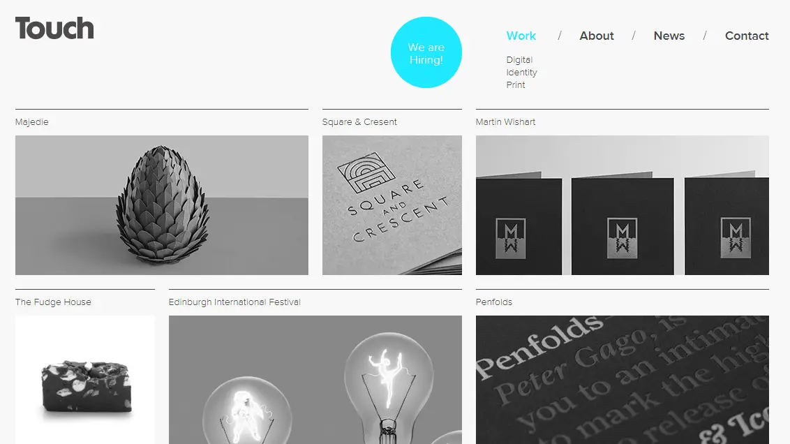
Example by http://www.thetouchagency.co.uk/
Design for Both Desktop and Mobile
Smartphones are vying for dominance as the prime device for content consumption. When we construct a website, we meticulously sculpt it to perform with equal brilliance on both the tiny screen cradled in your palm and the commanding desktop monitor.
Headers, visuals, and even the humble button must be usable and properly scaled according to the screen size.
Treat mobile and desktop design not as twins, but as siblings—related but with distinct personalities.
Content Structure
Content should follow a logical flow and hierarchy, guiding the audience towards a clear conclusion while maintaining engagement. Each piece of content should contribute to building understanding of your brand and purpose, keeping readers interested in what comes next.
Header tags are essential for structuring content and aiding web crawlers in ranking your site for web searches . Even if all content isn’t finalized at the design stage, using headers helps frame the structure of the website. Lastly, visual elements, including images and graphics, should be organized to define sections and complement the written content effectively.
Test, Troubleshoot, and Improve:
Web design is an iterative process. Regularly testing and troubleshooting your site, listening to user feedback, and being willing to make changes is essential for staying ahead in an ever-evolving digital environment.
Conclusion
Let’s hit a high note and recap the essentials. Speed, the quicksilver of web design, don’t keep your audience waiting or they’ll be quick to exit stage left. White space is your canvas, so paint a picture that allows content to breathe and engage. Typography is your crescendo, your design’s voice. Anchor your creativity with conventions and the ‘F’ pattern, crafting familiarity that resonates with human habits. Remember, whether on desktop or mobile, your website needs to sing on any stage.
And finally, rigorous usability tests are the scales to your design’s concerto. By adopting an iterative approach, you’ll ensure your website performs a flawless encore every time. No need to fret if you can’t pluck the perfect design out of thin air; with these strategies, you’re well-tuned for success. Just remember, in the orchestra of web design, it’s your website that should take the lead violin.


